
Molbio Website Redesign
Molbio offers a 'global first' platform that can perform Molecular Diagnostics for infectious diseases at the point-of-care - Truelab Real Time Quantitative micro PCR System.
Summary
Timeline
My Role
Tools
Designing for scale
Our client Molbio site has been operating with the current visual design architecture with only minor changes since 2000. As the site has added content, new product(ex. RT-PCR test kit) and a new architecture, it has become increasingly complicated and difficult for the user to navigate. I was asked to redesign the website for better visual appearance having the product business key points in mind.
10-12 Days(Feb-March 2022)
I took the UX, and visual design.
Figma, Adobe Illustrator
An interesting part of this project was how this website visual appearance could be improved. How did our best selling product Truenet could fit into this? How could we help customers keep focussed on a conversation, and not overwhelmed by volume? How and where do we can announce our new publication?
Taking a super collaborative approach, I involved engineers and leadership at every turn — making sure everything we produced was technically viable but also represented the direction the company and market was headed. Working across hemispheres, a big part of my approach was sketching, prototyping and video feedback.

Product walkthrough
Product description was shared with the team to openly discuss the product concept and how we have to focus on the better visibility of the product.
Problems with Molbio

Navigation menu seems too complex. Even the search, region change and other option were not too clearly visible.
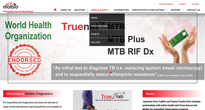
Dropdown menu design was too outdated. Event the hero section was too complex for the first time user. Text were not placed properly and the images were too much comple having many text over them.

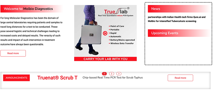

Product explainer video, news, upcoming events and announcement section was forced into a smaller section. Even the fonts, heading and the gradient were too bad.
Solutions in the redesign

Cache Permission when users open the website for the first time

Navigation Menu and the hero section with clear images and clear headings for better visibility and appearance

Latest news will be highlighted at the top and the search and language section is also very clear to the users

Three sectors Molbio is focusing to sell their product. These has been given a proper section so that it would be very easy for the users to select their section.

Video section for product explainer video. A video is 100 times better than 1000 words.

Featured product section. A 3D effect has been given to these products for better visual appearance.


In between ads, banner and testimonial section


Latest news, publicaiton, upcoming events and announcements have been provided three different section with much clear visibility

A separate space for extra video and the social media sharing so that to engage users in all other platforms handled by Molbio.